
This chart is very good for dipicting the business cycle by going recession and depression all the way through boom and inflation. This is a good chart but is not a visual that is too appealing because of the vagueness.

I think that this is a great graph because of all the information its presents to the reader and shows the phases that the business cycle goes through. However, I don't like because it can be confusing to the reader if they are looking at it for the first time.
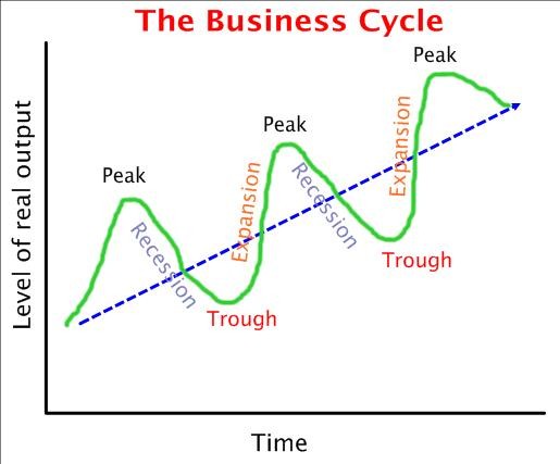
This graph is very good along with all the others. I like this graph because its very concise; it shows the cycles and depicts and explains each spot where something is occuring. This is the most simple and easiest to look at and understand. There is nothing I could find to say anything bad about this graph.
I give the "BEST GRAPH OF THE ECONOMIC SEMESTER" award to graph number three for being short, sweet, and to the point. This graph is very concise and can still hold a lot of information that can be easily understood by any reader. It's also very colorful and that helps appeal to the reader as well.
No comments:
Post a Comment